

DESIGN SYSTEM

PROJECT SUMMARY
THINGS
DONE
High fidelity prototype, UI design, UI design documentation
ROLE
UX designer and researcher
TOOLS
USED
Figma, Miro
PROJECT
CLIENT
Twitch
INTRODUCTION
“Twitch is where millions of people come together live every day to chat, interact, and make their own entertainment together.”
Twitch is an American video live streaming service that focuses on video game live streaming, including broadcasts of esports competitions, in addition to offering music broadcasts, creative content, and "in real life" streams.
THE BRIEF

We were tasked to analyse Twitch’s existing design system and identify opportunities for enhancements. Following which were to propose an in-depth revamped design system.
3 GOALS
-
Analyse Existing Twitch’s existing design system
-
Identify opportunities for enhancements
-
Propose a revamped design system
SCREEN LEVEL EVALUATION
First, we looked at various screens in Twitch and highlighted some pain points and consistent problems that we noticed while using the site. Several of our team members were new users and were able to offer neutral, unbiased feedback as well. and From this, we hoped to discover what changes should be made for improvement.


PROBLEM STATEMENT
How might we ensure twitch’s user interface is modern and easily accessible, where users can express their individuality and unique identities.
OUR 4-PRONGED APPROACH

1) Restructure our driving principles
Research / Experience
Identify Brand’s Purpose
Synthesise Principles
Prioritise
& Define
IDENTIFYING OUR PURPOSE: To better understand our design direction, we identified Twitch's crucial purpose: to facilitate connections among people and serve as a livestreaming tool. We achieved this understanding by empathizing with users' current experiences through testing the platform and reviewing feedback from app stores and social media comments.
PRIORITISING PRINCIPLES: From Twitch’s purpose, we came up with several principles and prioritised them according to walter’s hierarchy of user needs. Our chosen principles (highlighted below) based on how well they fulfilled the user's needs.

CORE DESIGN PRINCIPLES:
-
Attractive - Users should be attracted to the video content (new and creative content) and be addicted to watching more
-
Inclusive - Interface should allow all types of users to navigate the interface easily, and help users feel included and welcomed.
-
Secure - Product needs to be secure, (i.e. no data breach, secure payment)
-
Ease - Users should be able to use the product with ease and have the ability to express themselves freely in communities
2) Modernise for younger audiences
REFRESHING ICONS
Focusing primarily on solid-fill vs outlined icons ties in with our principle of accessibility. According to a research study, Solid-fill icons were generally faster to recognize than outlined icons.
For smaller spaces, the secondary icons can be used instead due to their more recognisable characteristic cues.

INTERACTIVE ANIMATION
Interactive animation is used to connect and engage users in a fun and creative way. With this modernized approach the younger users are more captivated with Twitch’s interface.
For hovering animations, the line of motion follows the diagonal angle of the twitch logo, this helps to add a 3-dimensional look to elements.
HOVER ANIMATION

ICON ANIMATION

BUTTON ANIMATION
3) Improve accessibility & information hierarchy
ADJUSTING COLOURS FOR SENSITIVITY
Comprehensive range of colours were chosen to give users a diverse range of options when customising their interface. We analysed Twitch’s existing colour palette and made changes:
-
Colours made less jarring, and easier to look at for long periods of time.
-
Removed some colours
-
Added palette for text & background

COLOUR APPLICATION
Because of our extensive colour palette, it is important that accessibility is not compromised.
Text and background colours need to be intentionally chosen to ensure readability by people of varying vision levels. This means contrast ratios should adhere to a minimum 7:1
(Twitch existing colour has a lower contrast ratio)

ACCESSIBLE TYPOGRAPHY
Inter is a typeface that was designed for computer screens and thus fits well with Twitch as a digital brand. It is simple and neutral, allowing users to focus on content with ease.
Another consideration is that Inter is easily legible at small and large font sizes, making it more accessible.
We also removed one of Twitch’s fonts,Roobert, so there is consistency in the typography across all pages.

ORGANISING INFORMATION HIERARCHY STARTING WITH COMPONENTS
We went into the site and highlighted several key components such as cards, components and tags. After which, we prioritised our components based on how complex and impactful it is. This helped us know which components to focus and start on first. Components that are high visibility and low complexity were the components we started focusing on first.

1. IMPROVING BUTTONS
Buttons are a key component used across the entire interface.
On hover, the buttons are then emphasised with a darker shade or line to improve visual feedback. For buttons, we made some changes such as to increase the shade of the button, and added a line in the hover state so users have more visual feedback and feel more engaged.

2. ADJUSTING VISUAL HIERARCHY
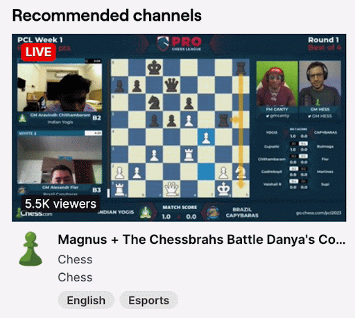
The featured banner section size was increased and navigation dots were added instead to not overwhelm users with having multiple content played at once. Currently, the UI can be a bit overwhelming with 5 content players shown at the same time. We decided to keep to just one banner and increase its size so that its easier for users to focus.

3. USING NAVIGATION TABS
We replaced the existing buttons with tabs, so users can keep track of which page they are on and filter their content with ease.
Von Restorff effect; tab that is selected is highlighted to help differentiate it

4. RE-ORGANISING CHAT BOX
Changes made for new users to use with ease:
-
Usernames as uniform colour
-
Increasing font size
-
Labelled icons
-
Keeping in mind that profits are important to streamers, we moved the gifters’ shoutout closer to the donate button (Law of Proximity)

5. INTRODUCING A SIDEBAR
A sidebar was introduced to give user the ability to gain ease of access to twitch’s content at all times. The collapsible sidebar gives user the ability to gain ease of access to twitch’s content at all times.

6. RESPONSIVE DESIGN USING BREAKPOINTS & FUID GRIDS
We created a 12 column grid to ensure elements are placed and aligned consistently across all pages.
2 versions were created based on the state of the navigation bar on the left. The expanded navigation bar version uses a 120px width grid, whereas the collapsed navigation bar version uses a 128px width grid.
We utilised breakpoints to help ensure our system would be easily accessible across different device sizes.
3 Breakpoints were set, with the content being funnelled into 2-4 columns depending on the width of the browser window.


RE-ORGANISING THE PAGE LAYOUT
We moved the navigation tab up to give users the ability curate their content (as you can see in the original, its in the middle of the page)
We also decreased the number of cards because according to Miller’s Law, organising content into smaller chunks can help users process info more easily.


4) Strengthen user identity & customisation
TONE OF VOICE
In order to bring out our design principles, we made sure that the wording:
-
Addressed copy to each user to make the website feel personalised (e.g. by addressing the user directly)
-
CTA wording and Section headers are clear and to the point to avoid any confusion and improve accessibility
-
Ensure tone is consistent across the site to keep the personality consistent

DARK/LIGHT MODE TOGGLE
Dark mode can be help improve accessibility, attention, and focus, as it creates less strain on the eyes, especially for users with disabilities.
Users are given the option to adjust the mode to their comfort and preference.

COLOR CUSTOMISATION
Users are given the ability to choose their preferred colour, and this will be applied to various components across the interface.
This helps gives creators more ownership over their channels and lets them express their identity.


Applying our Design System
We were tasked to analyse Twitch’s existing design system and identify opportunities for enhancements. Following which were to propose an in-depth revamped design system.

Here are some of the consolidated pages:
.jpg)

.jpg)
.jpg)
CONCLUSION
Have we solved our problem statement? Which is How might we ensure twitch’s user interface is modern and easily accessible, where users can express their individuality and unique identities.
We managed to accomplish the following:
-
Reorganised the information hierarchy - Adjusted the layout of components in the screen and tweaked elements to improve accessibility.
-
Increased customisation capability - Included more personalisation into components so users have more ownership of their channel.
-
Made the site more inclusive for new users - Improved accessibility through responsive design and new components such as toggle and sidebar.
-
Adjusted UI to be consistent with principles - Ensured that all screens adhered to our principles of: Attractive, Secure, Ease and Inclusive
To a certain extent, we have solved our problem statement. However, we still need to test the feasibility and functionality of our recommendations.
MOVING FORWARD
We need to:

WE LEARNT
